June 8th: Design systems, AI icons, and frontend struggles.
@itsmeterrylin|June 8, 2025 (6m ago)0 views
Published: June 8, 2025
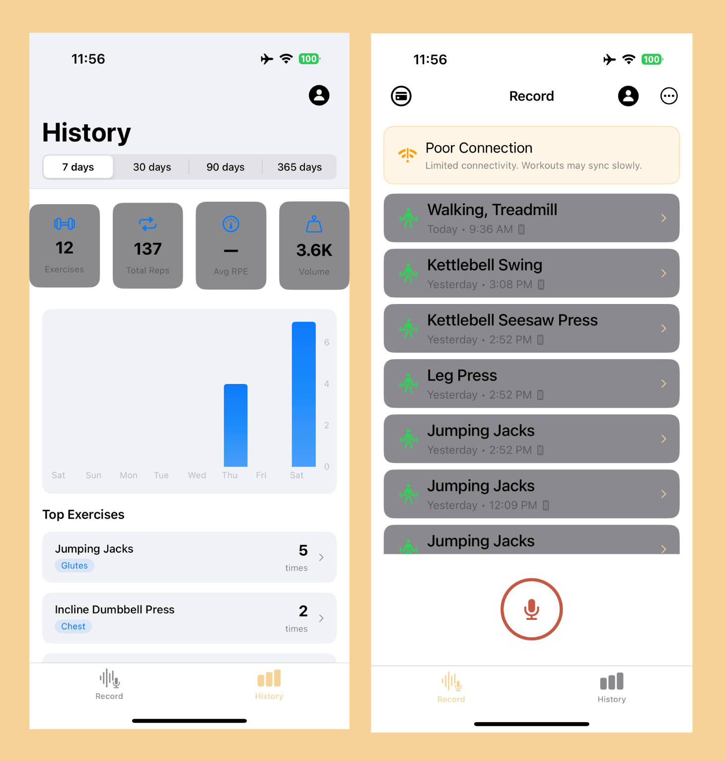
This week I've been focusing on redesigning the frontend of the iOS application. My backend is mostly done, and now I've fine tuning the user experience end-to-end.
✅ What Went Well
Design system breakthrough: Finally got my Figma setup dialed in with proper typography hierarchy (headers to captions) and color tokens. No more hard-coding every text size and color—everything references the system now.

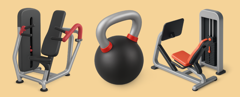
AI-generated icons: Used GPT-4 to generate all my workout equipment icons (barbells, treadmills, etc.). The key insight was using consistent prompts with the same color schema to maintain visual cohesion. It's wild that you don't need to design from scratch anymore—AI handles the heavy lifting while you focus on the system and consistency.
❌ What Didn't Go Well
Frontend design continues to be my biggest challenge:
Light mode and dark mode was a massive struggle: When I simply inverted colors for dark mode, it failed spectacularly—what looked good in light mode became completely unusable. I spent way too much time trying to make both modes work perfectly.
Eventually I realized for V1, I don't need to overwhelm myself by designing the application twice. I decided to focus on getting the app looking right in light mode first, then tackle dark mode later. Sometimes the best decision is knowing when to scope down and keep moving forward.
💡 What I Learned
Move slow to go fast: When it comes to Figma designs, taking the time upfront to define your design system—typography, colors, and general shields—is a lot of work initially. But once you get this foundation down, it's exponentially faster to prototype based on a set of universal rules for the frontend. The investment in systematic thinking pays dividends later.
What I'm Doing Next Week 🚀
Figma state mapping: I'm realizing that building out the full design system requires more effort than I initially thought. I need to think through all the different UI states systematically.
My plan is to create a state table with four columns:
- Current State - What the UI looks like now
- Trigger - What user action or event happens
- Transition - How the change happens
- New State - What the UI becomes
This will help me map out every interaction and ensure I'm designing for all the edge cases, not just the happy path. It's more methodical design work, but it should prevent the scrambling I've been doing when I realize I missed a state.